
Pin Design Tips: Artwork Rules for Custom Lapel Pins
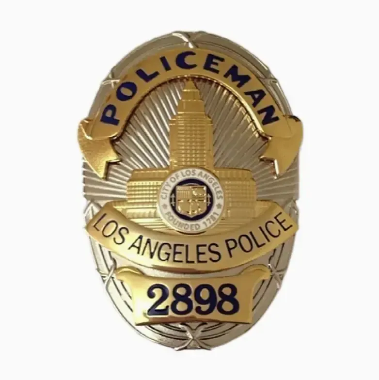
Good pin design starts with a simple truth: the artwork you send is not the artwork that gets made. Between your file and the finished badge sits a metal mould, a set of enamel fills, a plating bath and a polishing wheel. Each step changes what your drawing can and cannot hold. Get the file right at the start and the whole order runs smoothly. Get it wrong and you will spend a week approving revisions you did not budget for.
This guide covers the artwork rules we use every day in our workshop, from size and line width to colour separation, Pantone references, plating and backing choice. If you are a brand manager, a club secretary or a race organiser sitting on a logo file, this is the checklist you want before you email anyone.
Start with size, because everything else follows
Most lapel pins land somewhere between 20 mm and 40 mm across. That range is not an accident. Below roughly 20 mm, detail collapses. Above 40 mm, weight and cost climb and the pin starts to feel like a badge rather than a lapel pin. A 30 mm round pin is the comfortable middle for a logo with a short line of text.
Here is the blunt part. Your logo was probably built for a website header or a business card. Shrink a six-word tagline down to a 25 mm pin and it becomes a grey smudge. Pick the two or three elements that carry the identity and drop the rest. A mascot, a wordmark, a founding year. That is usually enough.
Think about viewing distance too. A pin is read from a metre away on a jacket lapel and from a few centimetres in a collector's hand. Both matter. Fine internal detail is for the person holding it, so do not sacrifice the big shapes to protect small ones.
A quick size guide
| Pin size | Good for | Watch out for |
|---|---|---|
| Under 20 mm | Simple icons, single letters, tiny club marks | Text smaller than a few millimetres becomes unreadable |
| 20 to 30 mm | Most logos, school and club badges, recognition pins | Keep to one short line of text |
| 30 to 40 mm | Detailed emblems, event pins, souvenir designs | Higher unit weight and cost |
| Over 40 mm | Statement pieces, shaped designs, photo-etched plaques | Backing needs to hold the weight |
Odd shapes are fine. We cut to your outline with laser or hydraulic cutting, so a pin does not have to be a circle or a square. Shaped pins often look better because the silhouette does the work that a border would otherwise do.
Minimum line width and gaps: the rule your file must respect
Enamel pins are made of metal walls with colour sitting between them. Those walls are the lines you see on the finished pin, and they need physical width to survive stamping or die-casting. If a line in your artwork is hair-thin, the mould cannot hold it and it will either disappear or merge into the neighbouring line.
We do not publish a single number for this, and neither should anyone else who is being honest. The real minimum depends on the metal (copper and zinc alloy behave differently), on the process (stamping versus die-casting) and on the overall pin size. What you should ask your supplier is simple: what is your minimum line width and minimum gap at my pin size? A good factory answers with two figures, one for the metal line and one for the colour gap between lines.
The gap matters as much as the line. Two colour areas separated by a wall that is too thin will bleed into each other during filling, and no amount of polishing fixes that. Scaled artwork with thin strokes is the single most common reason a pin gets redrawn. If your design has hairlines, expect the factory to thicken them or ask you to approve a simpler version.
Text is the usual trouble spot
Serif fonts with fine strokes are the worst offenders. Script fonts with connecting loops are a close second. Sans-serif capitals behave best because the stroke weight is even. If the text must stay small, consider converting it to a shape and simplifying, or move it to a printed pin where ink does not care about metal walls.
Spacing between letters matters too. Tight kerning makes two letters read as one blob once the metal lines between them thicken. Loosen it before you send the file, not after you see the proof.
Colour separation and metal lines in enamel pin design
Enamel is not paint. Every colour on a hard enamel or soft enamel pin needs a boundary, and that boundary is metal. This is what people mean by colour separation, and it changes how you build your file.
For hard enamel, each colour is hand-filled as a glass-like powder and fired separately. We fire one colour at a time in the kiln, which is slow but stops colours bleeding into each other. The surface is then polished flat so the metal and enamel sit level. For soft enamel, colour goes into the recesses and is baked, leaving the metal raised. Both processes need the metal walls described above.
What this means for artwork: do not rely on gradients or soft blends inside an enamel area. They cannot be filled. Convert them to solid blocks or send the job as a printed pin. Similarly, avoid colours that touch with no line between them, because the mould needs a wall to hold each fill. If two colours must sit side by side, add a thin metal line or merge them into one shape.
Our breakdown of hard enamel versus soft enamel covers how the two finishes differ in feel and cost. For artwork purposes, the short version is that hard enamel hides fine lines less well and rewards a flatter, bolder design.
Pantone references, not screen colours
Send Pantone Solid Coated numbers. That is the reference our design team works from, and it is the language most factories share. A hex code from your brand PDF will not survive the trip through pigment mixing.
Pantone is a standardised colour matching system, and the coated book is the one used for solid ink and pigment work. Name the Pantone number for each area in your file, or in a short list alongside it. If your brand has an official colour, give the Pantone equivalent rather than a screenshot of the logo.
One honesty note: the finished enamel will not match a printed Pantone chip exactly. Enamel pigments, plating colour and polishing all shift the result a little, and the same colour looks different next to gold plating than next to nickel. Ask for a physical sample if the exact shade is critical, and approve it before production.
When printed pins beat enamel pin design tips
Some artwork simply should not be made in enamel. Photographs, watercolour effects, soft gradients, dense multicolour illustrations, tiny text blocks. For these, printing is the right call.
Printed pins let a logo or illustration be reproduced without fine metal lines around each colour, because the image goes from digital file to printing plate. There are two routes. Silkscreen printing applies solid colours one at a time; more colours mean more setup, so it suits a limited palette. Offset printing, also called four colour process, uses CMYK and handles gradual colour well. Both need an epoxy dome over the print to protect the ink and give the glossy finish.
You can read more about the mechanics on screen printing and offset printing. Practically, printed pins make sense for large quantities with tight deadlines, and for designs where photographic detail is the whole point.
Checklist: enamel or printed?
| Your artwork has | Enamel | Printed |
|---|---|---|
| Flat solid colours, few of them | Yes | Yes |
| Gradients or soft blends | No | Yes |
| Photographic detail | No | Yes |
| Raised metal texture wanted | Yes | No |
| Very large order, short lead time | Possible | Strong fit |
| Text under a few millimetres | Risky | Better |
Plating colour choices change the whole pin
Plating is not a small detail. It decides whether the metal lines read as jewellery or as hardware. Common options include gold, nickel, copper, bronze, antique finishes and satin. Gold warms a design up and suits heritage and award pins. Nickel reads modern and clean. Antique finishes settle into the recesses and make a design look older and heavier than it is, which is why military and club badges use them so often.
Two practical tips. First, match the plating to the dominant colour family in the enamel, not to your favourite metal. A cool blue logo on gold fights itself. Second, remember that plating covers every exposed metal surface, including the back and the edges, so it is visible from more angles than you expect.
There is also the budget conversation. Bronze plating can stand in for gold and nickel for silver at a lower unit cost, which is a normal trade in the industry. If a supplier offers you an unusually cheap gold, ask what the plating actually is. A pin that tarnishes in a drawer is not a saving.
Choose the backing after you choose the size
Backing choice follows use. A single butterfly clutch is the default and works for light pins on jackets and lanyards. A double clutch stops a wide pin from rotating on the fabric, which matters for anything over about 30 mm. A safety pin or brooch bar suits heavier pieces and older wearers. Rubber clutches grip better on smooth fabric. Deluxe options like a locking clutch cost more but hold a pin that people will wear daily.
For anything heavy or valuable, think about the wearer's jacket. A pin that pulls a hole in a linen lapel will not be worn twice. If you want the full comparison, our guide to enamel pin backing types goes through each option. If you are ordering for a club or a school, this is worth ten minutes before you sign off.
Free design and proofs: use them
Our design service is free, and that includes a proof before anything is made. You send the idea, we produce artwork for your approval, and we do not cut metal until you say yes. Our technical notes ask for Adobe Illustrator or CorelDRAW files with Pantone Solid Coated references, which is the fastest route to an accurate proof.
Use the proof properly. Print it at actual size and hold it at arm's length. Check the text is readable, the colours are named, and the shape is what you meant. Ask what happens to the thinnest line in the file. If your supplier cannot tell you, that is a warning sign.
Sampling usually takes 3 to 8 days, and production runs 7 to 15 days depending on the item. Reordering the same design means no new mould fee, and we keep moulds for two years. For a club that orders annually, that matters.
A short pre-flight list for your artwork
- Final size decided in millimetres, with the outline marked
- Vector file, no flattened images
- Pantone Solid Coated number for every colour
- No gradients or blends in enamel areas
- Thin lines either thickened or removed
- Text checked at actual size and loosened in kerning
- Plating colour chosen and noted
- Backing type chosen to suit size and use
- Decision made on enamel versus printed
- Request for a physical sample if colour is critical
You can also browse finished examples on our custom lapel pins page to see how shapes, plating and enamel translate into real pieces. Look at a hard enamel floral badge and a soft enamel character pin side by side and the design rules stop being abstract.
How to start an order with us
Email your artwork or your rough idea to [email protected], or message +86 181 2281 1289 on WhatsApp. Tell us the quantity you have in mind, the size, whether you want enamel or printed, and your deadline. We accept custom orders regardless of order size, so a small club run is fine.
Our team replies within 8 hours and sales are online around the clock. You will get free artwork to review, then a sample if you want one, then production after you approve. Payment is by T/T, L/C or PayPal. If you would rather talk it through first, the contact page has every route in. Yiwu TianYao Craft Co., Ltd. has been making custom metal crafts for over 40 years, and a lot of that time has gone into getting artwork right the first time.
Frequently asked questions
What file format should I send for custom pin design?
Vector artwork is best: Adobe Illustrator or CorelDRAW. Those are the formats our design team prefers because the lines stay editable and scale cleanly. If you only have a PNG or JPG, send the highest resolution version and we can rebuild it as vector artwork for approval.
How small can text be on a lapel pin?
It depends on the pin size, the font and the metal. There is no universal number, so ask your supplier for their minimum stroke width at your chosen size. Sans-serif capitals with even stroke weight hold up best. Serif and script fonts lose detail quickly, and very small text may be better on a printed pin.
Do I need Pantone numbers for enamel pin design?
Yes, Pantone Solid Coated references are what we work from. Hex codes and screen colours do not translate reliably into enamel pigment. Name a Pantone number for each colour area, and bear in mind that plating colour and polishing will shift the final shade slightly.
Can I get a free proof before ordering?
Yes. Our design service is free, and we produce artwork for your approval before any mould is cut or metal is stamped. Sampling usually takes 3 to 8 days, and bulk production runs 7 to 15 days depending on the item and quantity.